Yesterday when I was lurking in the Coding In Flow Discord, someone posted a question there.
This is confusing the hell outta me. So actionbar is the default one and toolbar is the custom one that is also recommended to use because of higher compatability. And the appbar is just a categorization name for the actionbar and the toolbar. Did I get that right? 😅
This was a pretty good question, and one that I had when I was getting into Android as well. So even though he got it right, I decided to answer it with a bit of the history lesson on how things evolved, as history lessons are pretty interesting and people will never forget the answer in future.
The introduction of ActionBar
In the older versions of Android, up until API 11, every window used to have a title bar. This just used to show the name of the activity which is being shown and you can control it by using the android:label property in XML Manifest when you declare the activity.

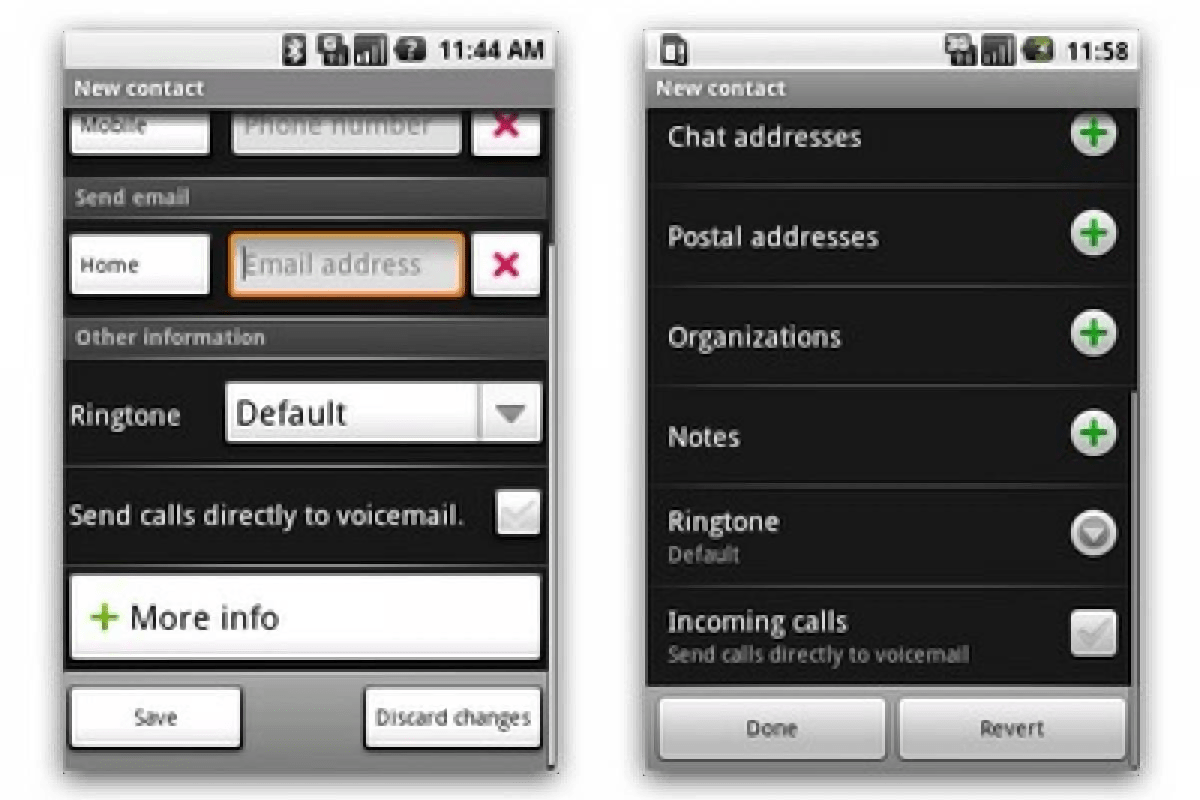
See the simple title bar on the screens saying New contact? That is the title bar and up until API 11, each and every activity used to have it.
In API 11 (Honeycomb) this was enlarged and new options were added to show a logo or an icon. In order to control this, new class called ActionBar was introduced. This class is part of the Android Framework itself. An interesting thing is, this ActionBar also supported tab based navigation (now deprecated) which was used in the Android Browser.

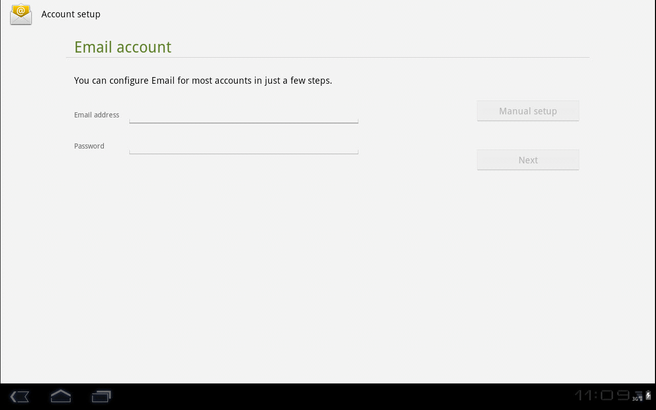
This is a screenshot from the add email account screen from a tablet running Android 3.0 Honeycomb (API 11). In the title you can see the icon and the large area for the name. Apart from this, the ActionBar also supported 3 different navigation modes.
- Normal mode with label
- Tab based navigation
- Dropdown based navigation
Since Fragments are introduced in the same API level 11, the tab based navigation is implemented based on fragments. It is deprecated now, but if you are interested, you can take a look at this YouTube video which demonstrates how they used to be.
It is pretty old, and deprecated now, but is an interesting history lesson nonetheless.
The introduction of Toolbar
In API 21 (Lollipop) the Toolbar class is introduced. This is because of the move to Material Design which introduced the UP button (the left siding arrow that you see today in most apps) and built-in ActionBar never supported that. Also, the navigation aspect of the app is completely re-imagined and standardized. Now, this Toolbar is implemented as a Custom View (also built-into the framework) and can be placed anywhere you want in your app (in a layout even nested). Google Maps is a notable app that made use of Toolbar right from the start.

So, is all that changed is the name? No, there are other changes as well.
- Remember that I said there were other navigation methods that are supported by the
ActionBar? This is now generified using support for custom views. - Along with the title, now we can also show a second label just below that, as a subtitle.
- A arbitrarily wide logo image which can fill the entire height of the toolbar.
Remember that this class is only introduced in API 21? That is why we have the Toolbar class from the AppCompat library instead, allowing us to use these toolbar features on API 16+.
The introduction of AppBar
Now comes the part of AppBar. Material design came out originally in 2014 and it is in 2018 they released second version of material design, the M2. The design language of M2 called a Toolbar as an AppBar. Just a name change.
So in essence:
AppBaris the design component name.ActionBaris the older implementation.Toolbaris the newer implementation.
Hope this clears up now.
