
It has been a while since I wrote anything in this site and I wanted to give it back some love. Both in establishing a personal brand and also share some things about what I love. Also, since I have last updated my website in 2016 and that is 5 years ago, I thought, well let me first give my site a make over. So I started in last April, but this time, decided to go with the proper way.
Why I needed to make this makeover?
Back when I first made this website, I was a student. But today, I’m a working professional Software Engineer with 4 years of experience. Every project that I was part of at work, always started with a design. Seeing that, I also started to read more about design thinking.
To design is much more than simply to assemble, to order, or even to edit; it is to add value and meaning, to illuminate, to simplify, to clarify, to modify, to dignify, to dramatise, to persuade, and perhaps even to amuse.
Paul Rand, Author, Graphic Designer, Teacher
So, what did I want to clarify? What did I want to simplify? As much as this is interesting quote, my thoughts are actually pretty simple. I went back to the basic question, which is, what do I want this site to be viewed as?
And the differences are quite a lot.
- I wanted people to see my site as a reflection of myself. And I wanted them to see me as a professional software engineer and not as a hacker.
- I wanted people to see the site with ease. However, I used stark different colours before, like Blue for the UI and Green for Headings.
- When people first saw my site, I wanted them to make a connection with me in the first sight. And I don’t want them to go to home page to find out who I am.
The Design Phase: To the drawing board!
The early design phase wasn’t great. But expected of course. I went on to learning how to make designs in Figma and started with what I needed the most. Since what most people look for in my site is actually either the blog section or the tutorials section (deduced from Google Analytics data), I started with the blog page.
When you’re making designs for the first time, it is pretty easy to get carried out. I got carried away too, and spent almost a month trying to pick colours. After a lot of time trying out different things after day work in office, I made these designs. Don’t even assume I took too much time to design just this – firstly I’m not a designer, and secondly I have my day work as a full-time software engineer.
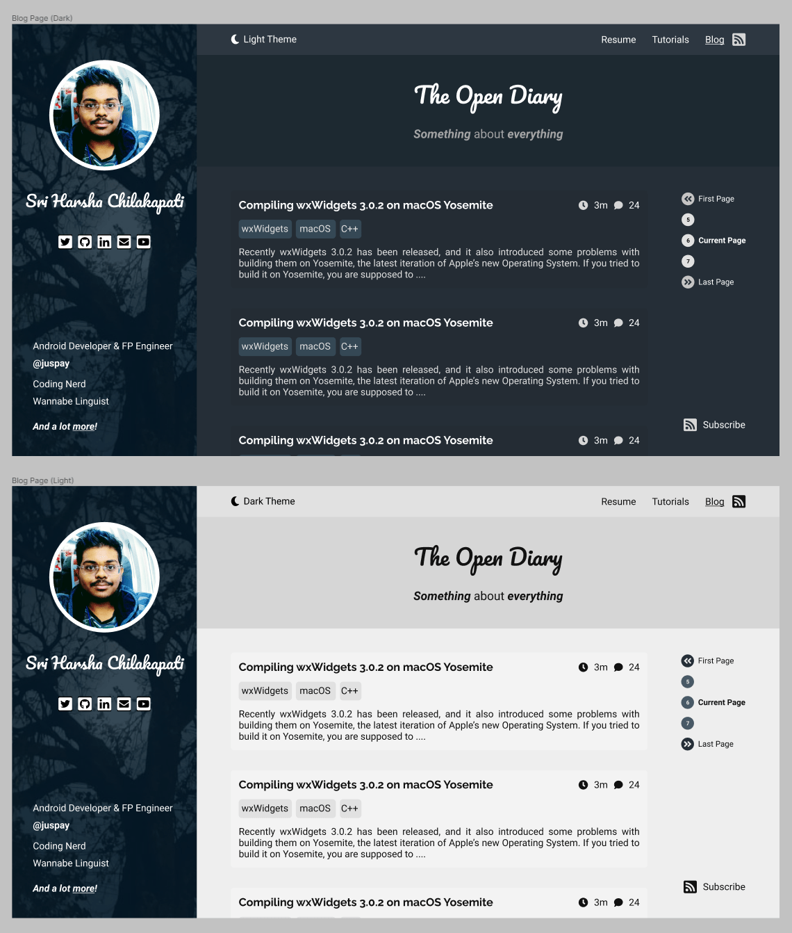
This makes sense in Figma, and looks beautiful to the eye too, but then UX comes into the picture.
- What happens if this page is running on a desktop with very large screen space?
- What happens if this page is running on a mobile device with small screen space?
- Are the colours really easy to be viewed by the users?
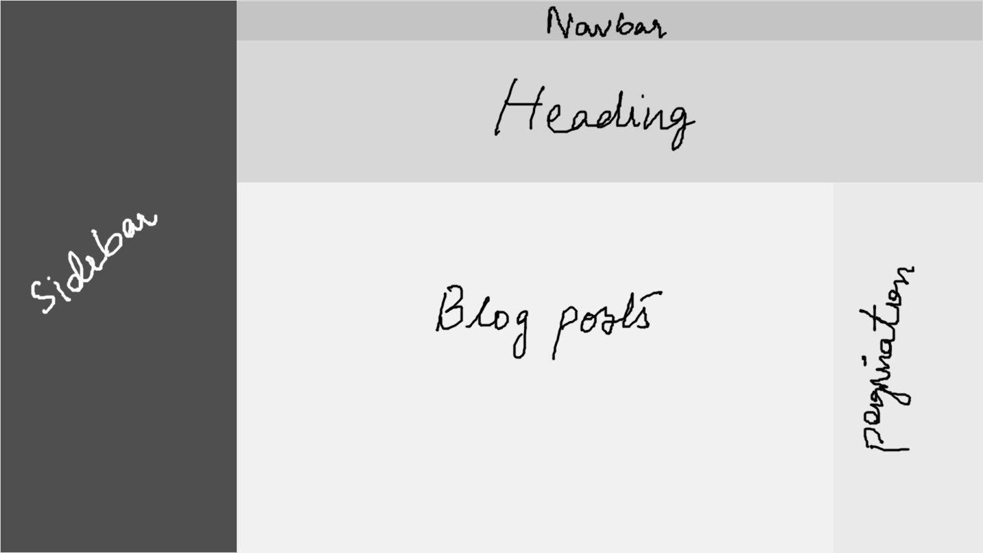
So after thinking about those two questions for a while, I came to the following conclusions.
- If the screen is large, then the sidebar has to stick to the left edge, and the pagination should attach to the right edge of the screen.
- If the screen is small, then the sidebar will be omitted and the pagination should convert to the horizontal one, like in the existing website.
- This one is hard to tell, so I have tried to use different tools. After careful observations from me and also some of my colleagues, I decided that the dark mode is not easy on the eyes.
Saying hi to the Implementation Hurdles!
Let’s first get this fact out: I’m not a web developer. Professionally I’m an Android Developer, and sometimes I work on iOS apps too. Even though I got this design sense since mobile apps are also in the front-end realm, there are a lot of striking differences too.
Like if you see the sidebar today and compare it to the design, it was hard to push the credentials to the bottom of the screen. And after I did that, I got a 4k monitor and stretching it to the very end made it hard for people to read them. If you still didn’t understand, think why did Linus failed to ZIP up and send files in his Linux Daily Driver challenge.
Bootstrap 5, even though it made writing layouts for different screen sizes a lot easier, it still meant that I have to have both the layouts in the single HTML file and only the right one will be visible depending on the media queries. This is bad from the UX point of view. First, the HTML file will become too long the more layouts I support making it hard. Second, my original design has different fonts for mobile and desktop layouts.
This also meant three places to place the paginator making it harder to debug. So, don’t push the profile text to bottom, no more side pagination and no more too complex layouts.
These aren’t all, there are countless hours spent browsing through StackOverflow for some of the issues which regular Web Developers might think are petty small issues. After a lot of searching and hacking on styles, the current MVP of the site is born and I rushed to deploy it to GitHub Pages.
Deployment is done, what next?
There are still a few bugs to be honest. Like in the mobile layout, the code snippets cause the user to be needing to pinch out zoom. I tried with the box-sizing attribute and setting it to both border-box and content-box but then this still happened. This never happened in Bootstrap 4 which I was using in my original theme for instance.
There are some places where I had to use a hack of using a .container inside a .container-fluid element to acheive the desired spacing around the post. Also had to hard code the max-size of the container on desktop since I feel Bootstrap’s default value is too big for desktop layouts (yes, even on my 4k screen).
There are places where because of improper organization, this site is importing fonts in multiple places although it compiles down to a single CSS file. This causes loading delays, so have to fix it out.
These will be ironed out over the coming few days. But hey, no site is perfect here isn’t it? Anyways, this is the update that I wanted to give you guys.
Thanks for stopping by, and reading it through!
 Facebook
 Linkedin